Conviviality, Warmth, Light And A Traditional Touch To The Apartment Design |Vibrant Spaces
Banglore (Karnataka),[India], March 07: Artistic elements in the interior design | Traditional and authentic design touches
Located in the bustling city of Chennai, near AVM Studios, is the Ms. Ramaresidence project. The ambition of the project is to bring conviviality, warmth, light and traditional touch to the apartment design. Our main focus was to transform a modern shell into an Authentic Home.
Neutral color palette with statement pieces
Art has an undeniable presence in this home, with sculptural pieces & hand painted murals throughout. A neutral theme can be observed throughout the home with statement pieces that highlight the space they are placed in.
Use of woody textures and accent flooring
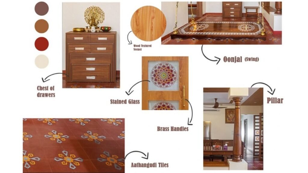
The palette of materials comes down to “Woody” textures with accent flooring (Aathangudi tiles), which contributed to the overall traditional look of the house, especially the living & dining area.
Concealed lighting in the apartment
Light cream walls complement a floating ceiling, cleverly concealing the general lighting in the apartment. The linearity continues onto the TV wall, emphasizing the overall height of the space. We paired a sand-colored sofa with a tan-colored ottoman to break the monochrome palette”.
Addition of traditional swing as seating furniture
A traditional swing has been added as additional seating furniture, facing the balcony hence to experience a beautiful view in the evenings.

Thinnai space with a traditional pillar and seating area
The so-called “Thinnai” space with a traditional pillar along the seater, defines the circulation and views of the house, making it the heart of the house. The seating area act as a separator between the two main rooms of the house, the living room and the dining room, places where the family usually gathers.
Wooden ceiling to outline the overall space
The wooden ceiling along the passage gives an outline to the overall space & the grooved wooden ceiling marks out the dining & formal living space.
The kitchen had a major drawback of lacking natural light due to a wall in-between kitchen & utility space. We had to do some civil alterations by breaking down the wall thus allowing natural light into the kitchen.
Kitchen with wood textured cabinetry and milky-white backsplash
We made sure we had continuity in the home intact through a repetitive color palette. Wood textured cabinetry and a milky-white backsplash frame the kitchen, accentuating the volume of the kitchen.
Concealed appliances for an uncluttered look
Most of the appliances are concealed inside the cabinets therefore the kitchen looks uncluttered. The additional tall unit that has been put on in the utility space became pantry storage with a small portion allocated to store cleaning accessories.
Master bedroom with ample natural light and neutral colors
The east-facing room, the master’s bedroom, is tucked in and plush, adjacent to a large balcony, thus flooded with ample natural light. The Master bedroom is adorned in muted shades upholstered in neutral colors like beige, and biscuit shades.
Bedroom with efficient use of storage in tight spaces
Neatly tucked into a niche is a Dresser unit in warm veneer on the side panels, which also wraps onto the sides of the wardrobe.
Cozy bay seater and gray-toned bed in bedroom
In Daughter’s bedroom, we had to work with tight spaces, large storage requirements, and still enough area to move around freely. With efficient planning, we utilized every niche to accommodate concealed storage.
http://vibrantspaces.in/testimonial
If you have any objection to this press release content, kindly contact pr.error.rectification[at]gmail.com to notify us. We will respond and rectify the situation in the next 24 hours.


